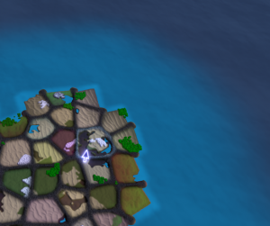
 Here’s a bit of experimental map design that I’ve done.
There are a few things to note. First is the new water.
The new water is a more standard video game water, much less stylised that what I used back in the MS10 build. But I feel that it fits in much better with the terrain style I’m using; the old water was much too “flat”, while this new water maintains a similar light/dark variation to that of the terrain itself, so they feel more like they fit together in the same game.
For those who are interested in render tech, this water is (currently) composed of two layers of water ripples, each of which is composed of two taps from a single normal map, moving in different directions and at different speeds. There is a very small amount of specular highlight, as well as a gentle fresnel effect on top that’s so subtle even I would have trouble pointing it out. (And of course it’s entirely invisible from the vantage point of this shot). There still needs to be a few more effects on the water, most notably some surf or other interaction with the shoreline. I may eventually decide to switch to using a flow map to control the motion of the water, but I haven’t felt a big need to do that yet. The ocean, after all, isn’t a major part of this game; it’s really just there to frame the map.
The other major difference (compared against the MS10 build) is the region borders. In previous builds, when a region was not owned (or was otherwise offline), I drew that region very dark. Now, I’m instead only drawing the borders dark; the rest of the region contents draw in their normal color and brightness. In this screenshot, I’m pointing at the only online region; you can tell because its borders are light, instead of dark. I’m not certain that this is quite visible enough, but I like that the map isn’t so overwhelmingly dark at the start of a game any more. Having such a dark map always made the water look like it was far too bright. Now the whole map is in much better balance.
What’s more, now you can actually look in the various regions you might expand into next, and decide which you prefer visually, instead of having to guess about what color a region would turn out to be, once you’d activated it.

