 I included this image in yesterday’s post, but didn’t really talk about it. So I’ll do that today.
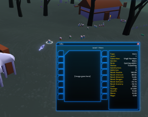
This is the current version of the “Info Window”. In the last few milestone builds, information about various things in the world could be retrieved by selecting the object and clicking the ‘Info’ button in the context matrix. A little panel in the HUD would slide out, and would display information about whatever was selected.
This is a replacement for that; you click the ‘Info’ button, and you get a whole window. The window can be moved around, has a close button, and generally behaves as you’d expect a window to behave. The information from the Info panel is still present (somewhat more nicely formatted), and there’s a lot of extra room for more information than would have ever fit into the old Info panel. Eventually, I plan to put some tabs on the window, to show more information. I haven’t yet decided whether the tabs belong on the side or on the bottom; but at the moment, I’m leaning toward tabs on the bottom of the window.
The plan is that this window will be the new way to configure things. By making it a window, I get a lot more space available for configuration controls, and I also gain back the left side of the screen, which I’m going to want to use during the tutorial, for helpful tutorial messages. Almost all of the “context matrix” can probably go away; I’ll move any necessary commands into here instead; all I need is a single, dedicated button to bring up the info window. And I can maybe do that with just a right-click on an object, without even needing a GUI button at all. Need to experiment with that.
Getting pretty close to an MS8 build. The tutorial is the last big-ticket item remaining in my to-do list. I’m hoping to have the milestone build ready for the middle of January.

