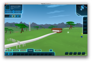
 I just wanted to mention how thrilled I am to have the game’s minimap actually working.
And it makes me smile a bit that it’s drawing using basically the same style (and data files!) that I was using for the whole game in MMORPG Tycoon 1.1.
In the minimap, the player is represented as a small dot in the middle, with a subtle gradient arc showing what you can see. (That arc changes as you look up and down, to try to reflect what can actually be seen).
There’s also the brand new interface in general, with just one action bar and tabs, instead of lots of separate action bars. This is a lot cleaner, and visually more interesting. The buttons in the bottom right (which are actually empty button slots in this shot) will eventually hold system function buttons; “Quit”, “Objectives”, and things of that sort. The bar on the right is a “quick access” panel, where the user can place copies of his favourite buttons from anywhere else. So if you’re placing a lot of trees (for example), you can put the tree placement button over there, instead of having to constantly switch between tabs to get back to that button. Finally, that “^” tab on the right side of the action bar isn’t actually a tab; it’s a button which causes the action bar to slide upward, to expose more rows of buttons. So if I want to provide lots of buttons in a single tab, I have space to put them. And the player can rearrange the buttons, so you can choose for yourself which are the most useful, and put them up in the top row. Not yet done is binding those buttons to the number row keys so that they can be activated by keyboard. But that’s coming. :)
Additionally, we finally have the return of the time control buttons, from way back in the early days. I haven’t yet hooked up icons to them, but that’s them with text labels in the bar in the upper left corner. Right now, I have “Pause”, “Play”, “Fast Forward”, and “Plaid” (because I was stumped for a name for something faster than ‘fast forward’). In practice, I’m probably going to merge those last two together, to reclaim some space within that button bar. But it’s all looking pretty promising.
I’ve also done a whole lot of work on the ground clutter. But that’s not really visible in this screenshot, so I’ll cover that in another post.
I’ve also (temporarily?) disabled shadows in my local build. Been arguing with myself over whether they actually improve the look of the game (and even if they do, if they’re worth the rather extreme rendering cost), so I’ve currently turned them off in my preferences, and am going to play with the game this way for a while.
Blog posts are fairly infrequent at this point. But I’ll try to get back from time to time with the latest bundle of updates. :)

