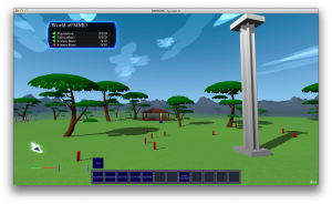
 So there’s been a lot of stuff going on over the last two weeks.
The first notable thing is that the “item” code refactoring is now complete. The only thing not working under the new system is the fake old “Punch”, “Kick”, etc. buttons which were displayed when on-foot but not in a logged-in game avatar. And I don’t mind that those buttons aren’t working under the new system, because they never did anything to start with.
Playing as a logged-in avatar does work. (Although the names of their attacks don’t appear on the action bar buttons for some reason. But the tooltips work and they function correctly, so I’m not too fussed over this at the moment)
Refactoring player AI to the new AI model and subscriber system is almost done. The last thing left to do is movement. Which I may not even do. Currently, everything in the game (except for the player) moves using a single system which is focused around specifying a destination, and then moving toward that destination in a number of small steps. The player, on the other hand, doesn’t set a destination; he sets which direction he wishes to move and how fast each frame. This means that there is separate code for moving an NPC character around than for the real player to move around. Which feels a little odd; the two should really use the same code, just with the real player providing input from keyboard/controller/etc, and the AI character providing input from AI code. But having the AI code only need to specify a destination and not the minutiae of motion per frame is pretty convenient. I’ll probably leave this as-is for the moment, and consider it more later on.
Regardless, I still need to impose the correct class-specified movement speed on the player when logged into an in-game character. Right now, the player uses the same player-speed as normal, instead of the class-speed that AI characters use.
New in the screenshot above, I’ve added the ability for the procedurally generated models to specify gradients. Right now, I’ve just hardcoded everything to blend lightly toward black at the bottom. When I first looked at it, I thought that this blend was nicely subtle; enough to make things look a little less flat. But after staring at the image for as long as I’ve been typing this post, I’m starting to think that it’s still too strong. Maybe half this amount of blend would be nicely subtle. (Edit: Yes, half this amount of blend is much better. Happy now. Now I just need to add a little tonal variation.)
In other news, I’m now consulting with a UI designer to give me some pokes and prods to solidify the game’s GUI elements. I’m not expecting that to come through any time soon (certainly not in time for the Milestone 2 build), but I’ll probably post some design elements on the site in the near future, to get folks’ reactions.
Milestone 2 build will be on this coming Sunday, whatever state the game is in. I’ll be posting Win32 and OSX builds. (If anyone’s keenly interested in a Linux build, drop me an e-mail or a comment; while I’ve succeeded at making builds for Linux, I’ve not figured out how to package and distribute one successfully) This will be very much a “shadow technology performance” build; the important feedback I’ll be asking for will be how well the build runs on your computer.
After a few days and some back and forth with folks, there will probably end up being a couple of different builds, with different settings for the shadow behaviour. But for the initial build, it’ll be the same settings that I’ve been using for the screenshots so far.

