There are a lot of different ways to create shadows in video games.
When I entered the game industry fifteen years ago, there were two standard ways to draw shadows: blob shadows and stencil shadows. (There was a third option as well: light maps, as popularised by Quake 2. But I’m not going to cover those since they were used for handling static lighting, not for real-time dynamic effects.)
 Blob Shadows
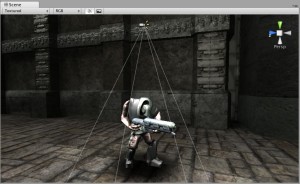
Blob shadows are a very simple concept. If we have a moving object that we want to have appear to cast a shadow, all we have to do is to draw a sprite on the ground beneath it. This sprite was typically an indistinct, blurry oval, roughly matching the general size of the object it was “shadowing”. Its texture is where the term “blob” came from. In this shot, you can see a robot with a blob shadow. (That blob shadow is substantially larger than I would ever make it, personally. At this scale, it’s far too easy to tell that it’s just a simple sprite).
A tricky point about implementing blob shadows is making the shadow appear correctly over a ground surface; making it draw on top of an undulating terrain is a surprisingly tricky problem. It’s very easy to end up with a shadow sprite that clips through the ground or floats above it, or is visible through other objects between the shadow and the camera. Since the shadow is basically just a big flat sprite, you can’t reliably cast the shadow onto an extremely bumpy surface, or onto another object. You’re basically stuck with just a flat circle on a (more or less) flat ground.
Fifteen years ago, these were the usual way of putting dynamic shadows on movable objects in a game. As games became more sophisticated, we started finding ways to disguise how simplistic these shadows were. First by scaling the blob as the character animated (so as the character moved his leg forward, the circular shadow would stretch forward into an oval shape), and then by actually giving each character several different blob shadows, each projected down from a different part of the character’s body. This made the shadow seem to vaguely move along as the character animated in a much better way than the simple scaling approach. In Transformers, we gave each enemy robot (I seem to recall) four or five blob shadows, each anchored to a different part of the robot’s body. When rendered, these separately circular blob shadows appeared to merge together into a single amorphous blob that moved in a way which didn’t draw the player’s attention as being circular and static.
This technique is still around and being used today in new games. Just a few months ago I implemented it for use in an (unreleased) iPhone racing game, where we used vaguely car-shaped blob shadows under the cars. With some very sophisticated maths to try to make the shadow mimic the car’s rotation in mid-air, and projecting down onto the race track surface according to an angled light source and angled track. But fundamentally, if you ignore the fancy math for scaling and orienting it to the ground surface, it was still just a single blob shadow; just a flat sprite with a pre-drawn texture on it.
I seriously considered using blob shadows for MMORPG Tycoon 2. It certainly would have been faster to implement than what I’ve actually done. But all the foliage in the game would have caused problems, since the shadows would have sorted underneath the foliage and been almost invisible in many situations. (Even in modern games you occasionally see this problem, blob shadows vanishing under ground clutter)
Stencil Shadows
Also called “shadow volumes”, stencil shadows were the high-quality alternative to blob shadows. They’re not used as much today as they used to be, but it’s still an interesting technique.
The basic idea of stencil shadows is to computationally find the silhouette of an object from the light’s point of view, and then extrude that silhouette through space. This extruded object is the shadow cast by the object.
You then render this shadow object using a “stencil buffer”, and use the resulting stencil data to determine for each pixel in your screen image whether that pixel is inside or outside of the shadow volume. I worked on several games which used this sort of system. Usually this approach was only used for the shadow on the player character, or sometimes large boss enemies; it was really too CPU intensive for us to be able to afford to do it for all characters on-screen. And even when we did do it, we would use simplified versions of the visual models; usually just a series of boxes or elipses roughly approximating the character’s shape. Finding the silhouette and building renderable extruded geometry every frame was simply too expensive.
Another interesting point is that because of the way that stencil buffers work, the shadow was always hard-edged; each pixel was either in-shadow or out-of-shadow, so shadows couldn’t feather or soften with distance.
To do this, you had to render the shadow volume with a special shader, and you had to render any object which might receive a shadow with another special shader. This was always more expensive than normal rendering, so quite a lot of effort often went into determining precisely which triangles might receive a shadow, just for the purposes of figuring out which bits of world geometry needed to have the expensive shaders enabled.
Fun note: The further your shadow geometry is extruded, the longer it takes to render, both because it touches more pixels, because it will more often have to go through the expensive geometry clipping process, and also because it potentially hits more world geometry, thus requiring more stuff to render using the expensive shadow-receiver shader. But if your renderable geometry didn’t actually hit a shadow receiver (the ground underneath the character, for example, because the character was high up in the air from a jump or something and the shadow geometry wasn’t extruded far enough downward to reach the ground), then no shadow would be visible at all; the shadow would appear to suddenly pop into being as soon as the shadow caster moved within range. Most games tried to hide this pop-in by making the extruded shadow geometry be built like a spike; smoothly scaling down into a single point — kind of the opposite of the shadow volume being extruded from the torus in the image above. If you look at games from the early 90s, you’ll occasionally see games which do this; you can tell because you’ll see that shadows get smaller as objects move away from their cast shadows, instead of getting larger.
To my knowledge, no modern games use stencil shadows any longer. And that’s mostly because they’ve been completely replaced by the new favoured system(s): shadow maps, which are better in almost every way.
Shadow Maps
As hardware has advanced, the power of graphic cards and rendering speeds have accelerated far faster than regular CPU processing. As a result, we’ve started to push all sorts of processing over to graphic cards whenever possible, since the graphic cards often have a lot more processing time available. Shadow maps are one of those cases.
 The basic idea of shadow maps is to actually render our scene twice: once from the point of view of the light, and then again from the point of view of the camera. By comparing what’s visible in the two shots, we can tell what is in shadow and what is visible from the point of view of the light.
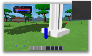
In this screenshot I’ve put a copy of the light’s render of the scene in the top right corner. A few things to point out about it: the light doesn’t care about colors or textures; all it cares about is how far away an object is. So it’s drawing its view of the scene with darker colors representing close objects, and lighter ones being further away. It’s also worth mentioning that the light doesn’t turn with the player’s camera; it’s always oriented with north at the top of the image. In this image, the camera is facing approximately northwest.
In the light’s view you can (roughly) see the column I’m standing beside, as well as the trees that are casting the large shadows on the left. (The more distant objects are not visible in the light’s rendering of the scene. I’ll talk about that in a moment)
So after I’ve rendered the light’s view of the scene, I then draw the scene normally, but with a little extra logic running per pixel. The logic goes like this: For each pixel I draw on the screen, I figure out where that pixel is in the world, and then where that position would be in the light’s view. If the pixel is further away than what the light could see during its render, then I know that that pixel is blocked from the light, and so I should draw that pixel as being in shadow. If not, then it’s in the light. And that’s pretty much all there is to it!
I’m a dirty liar
Actually, no, there’s a lot more to it than that. See, the chief problem with shadow maps is resolution. When the camera is close to shadows (as in this screenshot, and in almost all first-person perspective games), we really need a lot of pixels in our light’s view of the scene to keep our shadows from appearing blocky. But we only need that high resolution for the shadows that are close to the view; if we drew the light’s view of the scene at that sort of resolution everywhere, we’d have a terrible frame rate.
So what almost every modern first-person-view game does is to use a system called cascaded shadow maps.
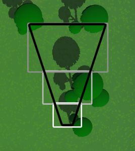
 A simple overhead-view of the player’s first-person view of a scene looks something like this. The black trapezoid (“frustum”, in 3D) represents the part of the game world which the player will be able to see in a particular frame. Anything outside of that frustum won’t be visible to the player, unless the player turns or moves. The player is at the narrow end of the frustum, looking toward the wide end.
When viewed from the player’s position (that is, not from an overhead view like this one), an object at the narrow end of the frustum is drawn using a lot more pixels than that same object being drawn at the wide end of the frustum. And this means that we need a lot more detail on things being rendered at the narrow end than at the wide end. This is true for everything, and a lot of computer graphic technology is built around dealing with this “how can we draw high quality stuff close to the player, and lower quality stuff further away” problem. For models, we have LODs; simpler versions of models which can be drawn with fewer triangles, for drawing when models are far away from the player. For textures, we have mipmaps, pre-filtered textures which are optimised for being displayed at smaller sizes on the screen.
Similarly, for shadows, we use cascaded shadow maps. The idea is that rather than draw one big shadow map as we discussed above, we instead want to draw several, each covering a different part of the view frustum. Traditionally, each shadow map (called a “cascade” in this context) has the same number of pixels in it; often 512×512 or 1024×1024. But one will cover a very small box in front of the player (thus having a very high pixel density), another will cover a larger area past that (thus having a lower pixel density), and there may be several more, each covering larger areas located further away from the player, and having coarser and coarser pixels. In the screenshot here, I have roughly estimated the positions of three cascades to fit the frustum, and outlined them as grey boxes.
Under this approach, when rendering a pixel, we first check how far forward it is from the camera, and then based on that distance forward, we pick which cascade to look in to decide whether that pixel is in light or in shadow. Right now, MMORPG Tycoon 2 has three cascades. One covers the first ten meters in front of the camera, the next covers the next 50 meters, and the last covers the next 800 meters. Each is rendering a 1024×1024 image from the light’s point of view. I’m not certain that these numbers are the best choices right now; It may well be that I’d be better off using more cascades with smaller images for each. Or maybe the cascades should be spaced differently. But fundamentally, the technology is in place and working; it’s only fiddling with numbers that’s left to do to tweak the behaviour.
Almost every modern first-person game out there uses exactly this system for rendering their shadows, at least in outdoor scenes. It’s easy to spot, once you know what to look for. Because we’re rendering several different shadow maps at different resolutions, all you have to do is walk forward in a game, and look for a spot where shadows change their level of detail. In an FPS, this will ordinarily appear as a horizontal line across the ground, where shadows visibly become more defined as you move forward.
So that’s cascades. There are a few other issues to be considered, but they’re probably too far down into fiddly points to be of much interest to most folks. I already talked about surface acne in a previous post. The opposite of that problem is called “Peter Panning”, where you’ve biased the shadows so much that they actually detach from the objects that are casting them, causing the objects to appear to be floating above the ground.
Another common problem is shimmer at the edges of shadows, as the camera moves and rotates. The trick to solving this is to move the light-view cameras in increments that match the distance between pixels in their shadow map, not rotating the light-view cameras to try to better fill the frustum, and not changing the sizes of the cascades from frame to frame. Doing these things means that if I move the camera (say) three pixels to the right, it will generate exactly the same shadows as it did before, just three pixels away from where it was generating them before. By comparison, if I moved the camera by a non-integral number of pixels, the shadows would still look very similar, but the precise pixels at the edges of a shadow shape would change, just based on rounding differently. And this generates a very distracting shimmer around the edges of shadows.
That’s really all I have to say on the subject. If I’ve forgotten something or if you’d like more detail on one bit or another, please ask in the comments!
