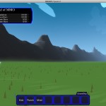
 So I’ve been spending a little bit of time looking at graphical things again, as I mentioned a week or two back. Today I finally turned my attention to “ground clutter”; just little details that I add to the ground around the player, to try to keep the ground from feeling too terribly plain, when the viewpoint is low down to the ground. In the screenshot here (if you view it full-size), you can see some of the old-style clutter. It was basically just dark green triangles on the ground.
Also notice the little red and green line at the bottom left corner of the screen — that’s my profiling data which shows how long it takes to render the scene. Now, in this case, I happen to be doing this bit of coding on an old laptop, so it’s actually running slower than it would on most modern PCs. But it’s still worth keeping in mind when you look at the next screenshot:
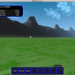
 Now, the first thing I’d like to mention is that this is “new-style” ground clutter, but I’m not yet happy with its appearance; it doesn’t yet match the style of the rest of the world. But there are a few notable points to bring up. First, there’s twice as much of it. In the first screenshot, there are 1000 pieces of ground clutter scattered around the player. In this second screenshot, there are 2000. Second, each piece of ground clutter is now made up of four triangles, instead of one. So in total, we’re drawing eight times as many triangles as we were before. Plus, these triangles now have textures on them (previously they were solid), and they have per-vertex color data, which was previously just a constant.
Now look at the profiling bar; with eight times as much stuff going on, it’s being substantially faster to render. Why is that? Well, as it turns out, it seems that a lot of processing time for the first shot was going into making all of those triangles correctly face the camera, whereas with the new system, I don’t worry about that at all, and so don’t have to reprocess all of the clutter every frame; I can just keep re-using it as long as the player doesn’t move around too far.
The real question from my point of view is whether I’ll be able to make this approach fit in with the general visual style of the game. It doesn’t seem to be working too well right now, but I’ll keep trying. I’m sure I’ll work something out.

