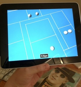
 So here’s the fun thing. The screenshot today doesn’t look much different than the one yesterday, and yet there’s been about ten hours invested in it. That time is mostly hidden inside the clock at the bottom center, which has some fairly complicated interactions with touch controls, much improved over the clock you could see in previous photos (which was limited to 15-minute increments). Also, there are now some spheres. But they’re just quick placeholders; not real artwork by any stretch of the imagination. Also new today is lighting; previously, everything was being flat shaded. (The nifty gradient you see is an artefact of the photography. A big TODO for me in the future is to work out how to make the game actually render with a cool gradient like the ones in the photos.)
As it turns out, it’s kind of tricky to make that clock appear at an unobtrusive size on the iPad, without making it ridiculously tiny on an iPhone. In the end, I’ll probably have to lay out the main game screen separately for the two platforms.
Anyhow, I’ll post more about the game itself once I’ve finished amusing myself by giving increasingly unsubtle hints about what it could possibly be. :)

