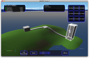
 More UI mockup happening. Here’s kind of what I’ve been thinking; please feel free to comment!
- Persistant bottom toolbar. This bottom toolbar will have about eight buttons in it, which will be square-ish (more square than the ones you see here), most of which will open other windows (such as the ‘Build’ button seen here, which currently opens the old Build toolbar from MMORPG Tycoon 1.1). The Online/Offline control will be moved to a separate screen. Not quite sure what to do with the time controls yet, but they don’t belong on the main button bar. The items on this button bar will all have keyboard shortcuts (probably simply numbered from 1-8). Goal is to have this button bar visually remind people of the bottom button bar in most MMORPGs.
- Persistant top left info bar. This top left information bar shows you information about your current MMORPG. Not sure exactly what information needs to constantly be displayed, but there’s space for about four or five tidbits of information.
- In the top right is a similar info bar about whatever your current selection is, and (if appropriate), a “Context Button Matrix”, which gives functionality specific to that object. For example, on a building, you’ll have “Upgrade” and “Downgrade” buttons, and also “Remove”, and possibly “Move”. And possibly more functions, as required. One button (probably in the bottom right position) will always be present in this matrix; that’s the “More information” button, which will open a pane that shows even more exhaustive data and configurable settings about whatever you have selected. This second info bar and the context button matrix vanish, when the player has no selection.
Other stuff.. in this screenshot, you can sort of make out the brightly-outlined view of the distant land masses, out at the horizon. The dark blue areas are seas which are far enough out that they aren’t being drawn by the regular rendering. That’s the same stuff you saw in the last screenshot, just viewed from down near ground level. That’s all temporary, and won’t be visible in the final game from this perspective, but I thought I’d mention what that is in case you guys were curious. :)
Other stuff. I’ve been having a bunch of trouble making the detailed generated terrain match up nicely with the large-scale region map (seen in the previous screenshot); those huge black areas look like they should be land when viewed from up high, but precisely where the shoreline begins is very unpredictable, and many of those black areas are currently generating as almost entirely underwater; the shore appears just before the next region in from the sea. (In fact, this screenshot is taken from inside one of those black shoreline “landmass” areas, and you can see just how little land is actually generating above sea level!) Since the current Perlin-noise-based terrain generation system is proving so uncontrollable, I’m reconsidering how to generate region terrain, and have come up with a few ideas that ought to give some nice and more predictable results; I’ll start prototyping those later this week.
Lately I’ve been thinking a lot about adding a text interface, so that most game commands are actually implemented via text commands. This would simplify a lot of my UI code, as I could then have just one or two types of button, which would simply send a text command when clicked, whereas right now I have dozens of different (but mostly similar) types of button in the codebase. Users would also get a benefit from this; it would allow power-users to type text commands into a console rather than search out a button in the UI, and it would make it possible to implement MMORPG-style keybinding and macros, sometime down the line. I’m not sure whether I’ll actually go this direction; it’d be a lot of work to modify the existing UI to work via this type of system. But I’m going to use this type of system for the “Context Button Matrix” pictured in today’s screenshot, and if that works out brilliantly, I might consider revamping the rest of the UI system to use it as well.
Finally, I’ve fixed a bunch of region issues. Fixed a lot of cases where particular spots in one region were mistakenly being considered part of a different region, fixed a float imprecision bug which would occasionally determine that a particular spot that was right on a region border wasn’t part of any region, and set things up so that region borders don’t appear bordering sea regions.. so that we can have nice beaches. That is, once beaches are generating in the right places. Oh, and I fixed a maths mistake which caused there to be strips of land a little over 200 meters wide bordering the north and east edges, just beyond the northernmost and easternmost regions in the region map.
Oh. And in the VectorStorm library, big performance optimisations to creating VBOs (via vsBuffer, when using the ‘set values in the built-in array, then baking them into a VBO’ method, as almost everything does), and a small performance optimisation to calculating Perlin noise., by eliminating some double-precision maths.
Tomorrow, I should have the context button matrix functioning properly, and will get rid of the “Remove Building” and “Move Building” buttons from the “Build” pane. And then I’ll start filling out the button bar. And maybe I’ll finally get around to writing that Graveship movement control I’ve been distracted from for so long. So much still to do! :)

