So I see that Geometry Wars 2 has been released on XBox Live Arcade. I kind of have to acknowledge it as it’s one of the few other glowy vector graphic games out there right now. And wow, they’ve really nailed the glowy vector thing in a big way.
Granted, in this revision they’re a bit less vector than they’ve appeared to be in the past; lots of things have been added which are obviously textures and there are plenty of curved lines (which usually aren’t present in old-school vector graphic games), but the overall look is still very nice.
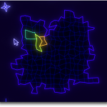
 So in reaction to Geometry Wars 2’s beautiful glows, I’ve been revisiting the glow shader used by VectorStorm games. Here’s a shot of the current map screen in the in-development MMORPG Tycoon 1.1, using my updated glow shader. For those who’ve played MMORPG Tycoon, you’ll notice a few interface niceties already; textual level ranges have vanished at this sort of zoom level and in fact, similarly-zoned regions are being drawn as just one larger region, when we’re zoomed this far out. Also, there’s a cute little compass rose in the northwest corner of the map. But really, this is showing off the new, brighter, softer, and much more accurate VectorStorm glow shader. I’m pretty pleased with it.
And it doesn’t even cost much more GPU time. In fact, the optimisations I made to the code probably actually make it cheaper, on most video cards. (Although I’ll confess that I haven’t actually profiled it)


